Poster ideas!!
 I would use the colour isolating effect that is used in the film sin city. Because the title of the film is called Blonde, I want to isolate the colour of the hair (blonde) by making it brighter and making the background black and white. This is clear that it is a thriller because most of the poster is in black and white which is dark and scary.
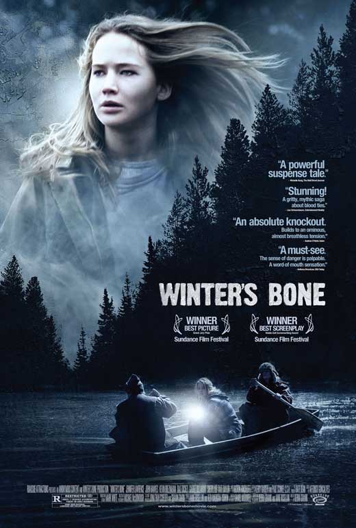
In Winter's Bone I like the overlay effect of the two images. I could use this on my poster to show both the main character and where the film would be set. The colours used are very dark using black and blues. This shows to the audience that the film is gloomy. The audience knows that it is a thriller due to the expression of the protagonist and the setting of the film.

Allot of the thriller movie posters include close ups of a face (usually the main character). This is used to make the poster more intense making the audience aware that it is a thriller film. Also the posters tend to have dark shadows which makes the poster more bold. I could use this effect by creating dark shadows in my poster.

 In this film poster it shows what we can assume is the protagonist of the film. The main colour in the poster is white which is a contrast to the genre of the film. The colour white symbolises purity but this goes against the genre of the film being a thriller because it is supposed to trick the audience. The audience are unsure who the villain is. Also the film follows the conventions of a thriller posters of showing the protagonists face. This makes it more appealing to the audience as the protagonist os looking straight at the viewer.
The film poster for shutter island uses dark shadows and colours to make it clear that it is a thriller as it follows the thriller conventions. The double exposure used in this poster shows both the location and the protagonist (presumably). The fact that the protagonists face is lit by the match is holding, suggests that the film is set in a dark and gloomy place. The shadows on his face makes the film poster more mysterious as the audience is not sure what is going on.

The Gone Girl poster is a bit different from the other film posters because the colour scheme is different. The colours on the poster start of black and then fade to light blue and white. This doesn't automatically show to the audience that the film is a thriller. The thing that makes it clear that it is a thriller is the fact that the title is not 100% visible.
No comments:
Post a Comment